Looking at a XVI century icon, we rarely consider, beside its value as a painting, the incredible events that are behind it. If we read the accounts, now history, that followed the various edicts and councils on the question of iconoclasm and the renewed cult of images, we are dismayed and incredulous at how much tension, suffering and devotion they managed to evoke. In that period, that saw not only the personal destiny of religious men at stake, but also the strategies of secular empires and ecclesiastic hierarchies, reaching up with near egual thrust to the beginning of this century in Russia itself, where icons owe to large extent their origins and distinctive characters.
Malevich’s extraordinary Suprematist intuition revealed through The Black Square (1913), an extreme chapter of epic tradition in mystical painting. XIX century painting owes him the chance to reclaim picture space, a place of supreme expression of a non-objective moral belief: the space around a painting. Malevich’s action was solidly grounded, based on orthodox iconographic culture and helped to open, on that foundation, a new possibility for painting of the future. We can appreciate that today both because of what was produced following his work and because of the dramatic outcome of his personal life and of his generation’s– this in anticipation (then unrecognized) of the catastrophe that was to engulf this country and European history itself.
The darkening of an image invokes a consumption, a slow wea ring-out, a stratigraphic deposit of outside agents alien to the picture, such as dust, smoke or other elements deposited over time on the artist’s original work. In the hands of a XX century painter, on the other hand, a choice of a dark field, of chromatic withdrawal, conveys a radical determination, a will to produce a “ground zero”, essential to eliminate all previous conceptions and open up to new speculations.
I believe Mats Bergquist’s contemporary work should be linked to that source, critical of all previous painting while extremely rich in itself. Although relying on other, more articulated veins of inspiration, not excluding a return to the disciplines of constant meditation, the generating drive of any true spatiality, it has always felt the need to regain a register of its own on that supremacy of univocal chromatism. Indeed, if we look at the process that brought Bergquist to his present work, documented in these pages, we notice how he constantly made the same linguistic choice, in considering a non-objective chromatic field, almost uniform in the layout of colour and mainly mono- di- or trichromatic, purely abstract with the use of opague or scarcely brilliant colour. Even if we go back to the work conceived and executed in Farfa, Italy, which is dichromatic with alternating stripes, and was compared by some to Burens surfaces, (which I believe wrongly) because the French artist (as well as Mondnan] never subscribed to diagonal linearity nor to layers of erasures and abrasions, which are present in Bergquist’s work and where the chromatic choice is reduced to a very few elements. The whole of these works, at the beginning of the Nineties, could rather be more coherently compared to some pictorial alphabet of Sol LeWitt, bound to forms of stripes of various colours and black and white, and found even in some wall drawings in Italy.
Bergquists’s works made in Farfa, Untitled, produced with oil on copper based oxidations and of various dimensions, already formulate a dark quality within themselves, more completely and clearly reaffirmed in the extreme cycle at the end of the Nineties.
A more stringent sequence of relations between these recent works and the rest of Bergquist’s production should rather be linked to the first “icons”, immediately mentioned by the contemporary philosopher Hans Ruin who evoked, this time correctly, a “sense of sacred” and some connection with Barnett Newman’s work, as well as the remarkable group of tempera works created between 1995 and 1997 on different supports and of differing sizes, that have seen myself at the exhibition arranged in the Sodermanlands museum in Nyköping, Sweden, during a trip taken in 1997.
Even though for that part of his production Bergquist has allowed the notion tha this choice of partiality could well be coming from certain Venetian iconography and especially from the spare three part background of Alvise Vivarini’s Madonna col Bambino, that he himself attests as a reply to Nina Weibull’s critique as a possible inspiration for his tempera, that particular point of references appears now to be no more than the first spark, or rather a starting point of a process of progressive refining towards an interior dimension that has long been bestowini a precise emotional and meditative investment on icons and their potentiality. I recall by analogy one more suggestion, the spatial disposition of the exhibition in Nyköping reminding me of another Renaissance work, the painting by Beato Angelico on the opening of the sepulchers, with a perspective flight from the main sarcophagus towards an open landscape.
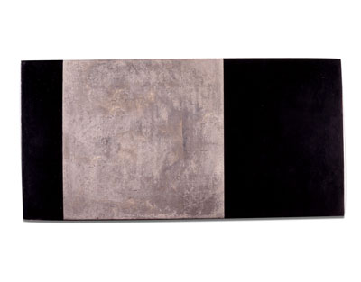
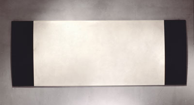
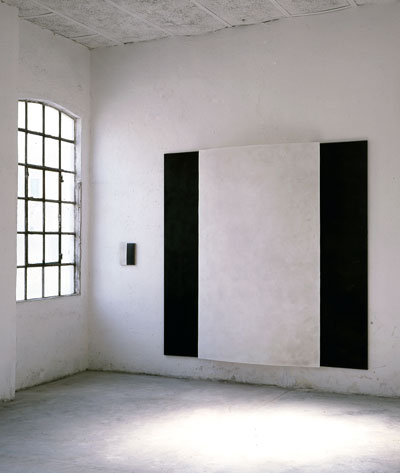
Already in the works of those two years there is an affirmation of spatiality that brings a strong element of proportional relationships between structural chromatic fields in each tempera work; usually two, three or more adjacent fields to compose a diptych as in Interior (1995) or Triptych (1995) or the four parts Lazarus (1997) or the large size (305 x 230) Untitled (1996). In addition, the paintings already showed the curved surface that has now become a distinctive element, with great or small relevance, but constant in every work. This curvature, besides evoking the natural deformation of many old paintings, both small icons and large altarpieces, conferred a slight swelling to the surface. almost a holding of breath, softening the rigidity of the works.
In the monochromatic painting of the Sixties and Seventies, Graubner had turned his attention to the spatial value of surface swelling, with evident and emphatic jutting out effects, achieving interesting results.
In Bergquist, however, this attention to curved surfaces is an evident remake of “historical painting’s curvatures, almost a visual quotation. On the subject of references, the works seen in Nyköping seemed to have rules of proportion and chromatic relationships more in line with Bnce Marden’s painting in the Seventies and Eighties, rather than with Günther Forg’s although the latter appeared more mercurial and volatile in use of supports and in the very way to use colour; Marden’s orthodoxy in painting and in treating space, rhythmically harmonious and proportionally inclined to “golden rules” could be called upon to give some previous reference to Bergquist’s earlier work .
With this last creative development, elaborating on the aspect of reductiomsm in the linguistics of his whole work, Bergquist confirms, both from the conceptual and the technical point of view, his inclination towards an iconographic non-objectivity.
Recently, his search into meditation and Zen practices has reaffirmed a radicalization of his choice of chromatic variations in those works that have been defined around the antinomy of the black and white relationship. Indeed the new works, based almost exclusively on the technique of icon production and therefore on linen-covered wood, treated with various layers of glue, plaster and pigments with abrasion of previously curved surfaces, and finished off with encaustic work, seem to affirm the absoluteness of choices that are behind the Neosuprematistic thinking, its conceptual orthodoxy touching on the sphere of real life.
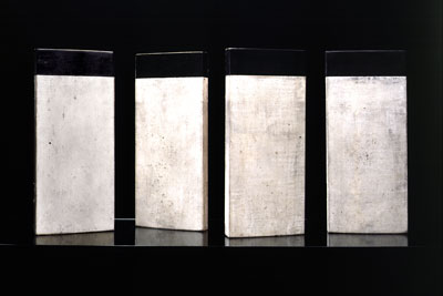
In the Bassano and Marostica residences where Bergquist now works, the series of a hundred Guides (1998) has emerged, inspired by Tarkowsky’s film Stalker- wooden modules bearing white or darkened by the encaustic works if by burning at the top of their surface, a marginal deeply black area obtained with vine black or with an ivory black of substantial opacity. In addition to this series of works, exalted by an attentive and austere manuality, we also have far-reaching works such as Icon (1999) or Codex (1999) where well-defined rules of proportion and significant balance can be read.
Among the types of wood used as a base, we find cherry wood, lime tree and the Hungarian pear tree. The latter has also been used to create a variegated series of cubic volumes, designed in different ways but all bearing one side slightly curved downwards, like a dome pulled down by the four vertices of the cube.
Although conceived as a whole, the single cubic units can occupy space as “fragments”, but lacking the absolute vocation claimed by the large paintings. These last morphologies stress the primary and supreme value of the body of work, its desertification and casting away of narrative trimmings, a necessity of iterative gestures, dominated by time, that, together with a feeling for colour or rather, a talent for its subtraction, have produced a look of meditated and experienced manual skill, like a prayer, for each one of these works. A newly advancing front of spiritual intensity that shares what is “sacred” with the authenticity of inner being and the invisible manifesting itself, through the manual work on materials and their proportions.
Through acts of new transformation, influenced by poetic desire, creating equilibrium between shadow and light, stasis and osmosis, absent and living.
Raramente si pensa, nell’osservare un’icona del XVI secolo, al di là della sua pregnanza pittorica, alle incredibili vicende che l’hanno preceduta. Se si rileggono le cronache, ormai stona, conseguenti ai vari editti e concili relativi all’iconoclastia e al ripristino del culto di quelle immagini, si resta sgomenti e increduli di quanta tensione, sofferenza e dedizione abbiano potuto suscitare. Quell’epopea attorno a cui si sono giocati destini personali di uomini di religione ma anche strategie di imperi laici e di gerarchie ecclesiastiche si può dire che giunga, quasi con eguale spinta, sino all’alba del nostro secolo, nella stessa Russia dove l’icona ha conosciuto una parte considerevole delle sue origini e dei suoi caratteri.
La straordinaria intuizione suprematista di Malevich ha dischiuso, con il Quadrato nero (1913) un estremo capitolo di quella epica tradizione pittorica mistica. E a lui tutta la pittura del Novecento deve la possibilità di riconquista autorevole dello spazio del quadro come luogo di supremo pronunciamento di un credo morale non oggettivo. Quanto fosse fondata l’azione intrapresa da Malevich, cioè radicata nella cultura ortodossa iconografica e quanto al contempo fosse rivolta a dischiudere su quel fondamento una nuova possibilità per la pittura a venire, si può oggi definitivamente apprezzare e misurare, sia in ordine alle conseguenze che dalla sua opera in poi si sono prodotte, sia in relazione al drammatico esito della vicenda personale e della sua stessa generazione, preannunzio, incompreso allora, della catastrofe successiva in cui sarebbe stato coinvolto il suo paese e la stessa storia europea. L’oscuramento dell’immagine evoca una consunzione, un lento logoramento, uno stratigrafico deposito di agenti esterni alla pittura come la polvere, il fumo o altri elementi che col tempo si sono sovrapposti alla primitiva azione dell’artefice.
Ma nel gesto del pittore del XX secolo, la scelta del campo oscuro, della sottrazione cromatica, reca una determinazione radicale, una volontà di introdurre un grado zero necessario per chiudere ogni precedente proposizione e poter riaprire ogni altra possibile speculazione.
È a quella fonte critica di tutta la pittura precedente e al contempo estremamente rigogliosa che credo si debba coniugare l’opera odierna di Mats Bergquist. La quale, se pur si giova di altre, più articolate vene di alimentazione, non esclusa quella di un ritorno alla disciplina meditativa costante, che di ogni autentica spazialità è il movente generatore, ha sempre avvertito la necessità di ritrovare un proprio registro su quella supremazia di univocità cromatica. Se si osserva, infatti, il processo che ha portato Bergquist alle opere attuali documentate in queste pagine, ci si accorge di come egli abbia costantemente compiuto la medesima scelta linguistica, cioè quella della considerazione del campo cromatico in oggettivo, pressoché uniforme nella stesura del colore, tendenzialmente mono, bi o tricromatico, puramente astratto, mediante l’uso del colore opaco o scarsamente brillante. Anche quando si retrocede alle opere concepite e realizzate a Farfa in Italia, bicromatiche e a strisce alternate, che taluno ha voluto confrontare con le superfici di Buren, a mio avviso impropriamente, giacché il francese (come Mondrian) non ha mai aderito alla linearità diagonale ne alle stesure di cancellazione o abrasione, presenti invece nell’opera di Bergquist, la scelta cromatica è ridotta a pochissime valenze. Peraltro il ciclo di quelle opere dei primi anni Novanta potrebbe essere più coerentemente raffrontato con certo alfabeto pittorico di Sol LeWitt, dedito a forme di righe in vari colori e in bianco e nero, realizzate persino in alcuni wall drawings in Italia.
Le opere di Bergquist realizzate a Farfa, Senza titolo, a base di oli e ossidazioni su rame, di vane dimensioni, già formulano, al proprio interno, una qualità umbratile che più compiutamente e nitidamente si riafferma dunque in questo estremo ciclo della fine degli anni Novanta. A una più stringente sequenza di relazioni tra questi recenti lavori e il resto dell’opera di Bergquist vanno invece ricondotte sia le prime ‘icone’ di cui scrive subito il filosofo coetaneo Hans Ruin, stavolta evocando giustamente il ‘sacro’ e talune relazioni con l’opera di Barnett Newman. Sia il considerevole gruppo di tempere realizzate tra il 1995 e il ’97 su diversi supporti e di diverse dimensioni da me stesso osservate nella mostra ordinata nel museo di Södermanlands di Nyköping in Svezia, durante un viaggio nel ’97.
Se per quell’arco della sua produzione Bergquist lasciava intendere che la sua scelta di parzialità poteva benissimo aver tratto le mosse da certa iconografia veneta e soprattutto dal fondo disadorno di motivi e tripartito di quella tavola di Alvise Vivarini Madonna col Bambino che egli stesso indica alla lettura critica di Nina Weibull, quale matrice possibile delle sue tempere, quel riferimento non appare ormai che come la dinamo d’avviamento o, se si vuole, il caposaldo di un moto progressivo di affinamento verso una misura interiore che all’icona e alle sue potenzialità rivolge, ormai da tempo, un preciso investimento emozionale e riflessivo. Per un’analoga suggestione, ricordo che la disposizione spaziale dell’intera mostra osservata a Nyköping, evocava a me un’altra opera dell’Umanesimo, quel dipinto del Beato Angelico sullo scoperchiamento di sepolcri, in prospettica fuga dal sarcofago principale verso un aperto paesaggio. Già nelle opere di quel biennio, si afferma una spazialità che reca una forte valenza di rapporti proporzionali tra i campi cromatici in cui ciascuna tempera è strutturata; di solito due o tré o più campiture confinanti a comporre dittici come Interior (1995) o il Triptyk (1995) o Lazarus (1997) di quattro parti, o Senza titolo (1996) di grandi dimensioni (305×230). Inoltre, le tavole già presentano la superficie ricurva che ora è divenuta un elemento distintivo di minore o maggior evidenza, ma costante in ogni opera. La curva impressa a quelle opere, oltre a rammemorare una naturale deformazione a cui molte tavole antiche sono andate soggette, sia tra le piccole icone sia tra le grandi pale, conferiva alla superficie un lieve rigonfiamento, quasi un respiro trattenuto, tale da stemperare la riquadrata rigidità delle tavole. Nella pittura monocromatica degli anni Sessanta – Settanta, a questa valenza spaziale del rigonfiamento della superficie con evidenti ed enfatici effetti di aggetto aveva rivolto la propria attenzione Graubner, giungendo a risultati interessanti. Ma in Bergquist l’attenzione per la sfondatura delle superfici è evidente recupero di quella curvatura ‘storica’ delle tavole, quasi una citazione. In tema di riferimenti, invece, quelle opere osservate a Nyköping sembravano avere regole proporzionali e rapporti cromatici più dialettici con la pittura di Brice Marden degli anni Settanta – Ottanta, piuttosto che con quella di Günther Forg, per guanto quest’ultimo si mostrava più mobile e volubile nell’uso dei supporti e nella stessa modalità di impiego del colore; l’ortodossia pittorica e spaziale di Marden, ritmicamente armoniosa e proporzionalmente incline ai rapporti aurei, sembra poter essere chiamata, relativamente, in causa per fornire qualche precedente di riferimento a quel trascorso di Bergquist. Ma con questo ultimo germoglio della sua creazione che approfondisce l’aspetto riduzionista già presente nell’impianto linguistico di tutta la sua opera, Bergquist conferma, sia dal punto di vista concettuale che tecnico, la sua inclinazione alla inoggettività iconografica e al contempo un interesse deciso per la sfora operativa nodulogica.
Recentemente, l’approfondimento di Bergquist verso interessi meditativi rivolti alle pratiche Zen ha riaffermato una sua radicalizzazione nella scelta delle varianti cromatiche delle opere che si sono definite attorno all’antinomia del rapporto tra il nero e il bianco. Le nuove opere infatti, attestate quasi esclusivamente sull’elaborazione di tavole con la tecnica della produzione delle icone a base dunque di supporti lignei rivestiti di tela di lino, trattati con vari strati di colla di coniglio, gesso e pigmenti, con interventi di abrasione delle superfici preventivamente munite di curvatura e rifinite con l’encausto, sembrano affermare l’assolutezza delle scelte dietro cui si muove un pensiero neo-suprematista, la cui ortodossia concettuale investe anche la sfera del vissuto. Da tale orientamento sono emerse, nelle residenze di Bassano del Grappa e di Marostica, dove attualmente Bergquist lavora la serie delle cento Guide (1998) ispirate al film di Tarkowsky Stalker – moduli lignei che alla sommità della superficie bianca o diversamente scurita dall’encausto come dopo una combustione, recano una zona marginale nettamente nera ottenuta col nero di vite e col nero avorio di rilevante opacità. Accanto a quella teoria di lavori esaltati da una manualità premurosa e austera, sono altresì emerse opere come Icona (1998) o come Codex (1998) di gran respiro, entro cui si leggono regole proporzionali ben definite e di notevole equilibrio. Tra i legni adoperati per i supporti, si osservano il ciliegio, il tiglio e il pero ungherese. Con quest’ultima fibra è realizzata un’altrettanto variegata sene di volumi cubici concepiti con diverse quote anch’essi tuttavia recanti una sola faccia lievemente ricurva e ribassata, come una volta tirata dai quattro vertici del volume. Pur essendo concepiti come ‘insieme’, le singole unità cubiche possono occupare lo spazio quali ‘frammenti’ privi di vocazione assoluta, come invece le grandi tavole rivendicano. Tutte queste ultime morfologie ribadiscono il valore primario e supremo del corpo dell’opera, della sua desertificazione e spoliazione da orpelli narrativi, una necessità di versamenti gestuali iterativi e dunque dominati dal tempo che assieme alla sensibilità per il colore, o meglio, all’attitudine alla sua sottrazione, hanno determinato l’aspetto di manualità meditata e vissuta, come una preghiera, di ognuna di queste opere. Fronte nuovamente avanzato di una intensità spirituale che del ‘sacro’ condivide l’autenticità della mozione inferiore e l’invisibilità resa manifesta dal gesto compiuto sui materiali, sulle loro proporzioni. Mediante atti di nuova trasformazione, sorvegliata dal desiderio poetico, di mettere in equilibrio l’ombra e la luce, la stasi e l’osmosi, l’assente e il vivente. Gioiello, agosto 2000.
Contact me